)
Refreshing The Biltmore's Elegance
Dee Malone, principal of D'Shakil Designs, recently led the design refresh of The Biltmore in Coral Gables as part of a $35 million renovation project. Meeting spaces such as the Granada and Alhambra twin ballrooms and the main lobby were all part of that redesign. Malone was chosen for her more than 30 years of design experience.
ALHI spoke with her about how she used the redesign to accentuate The Biltmore's historic architecture and past.

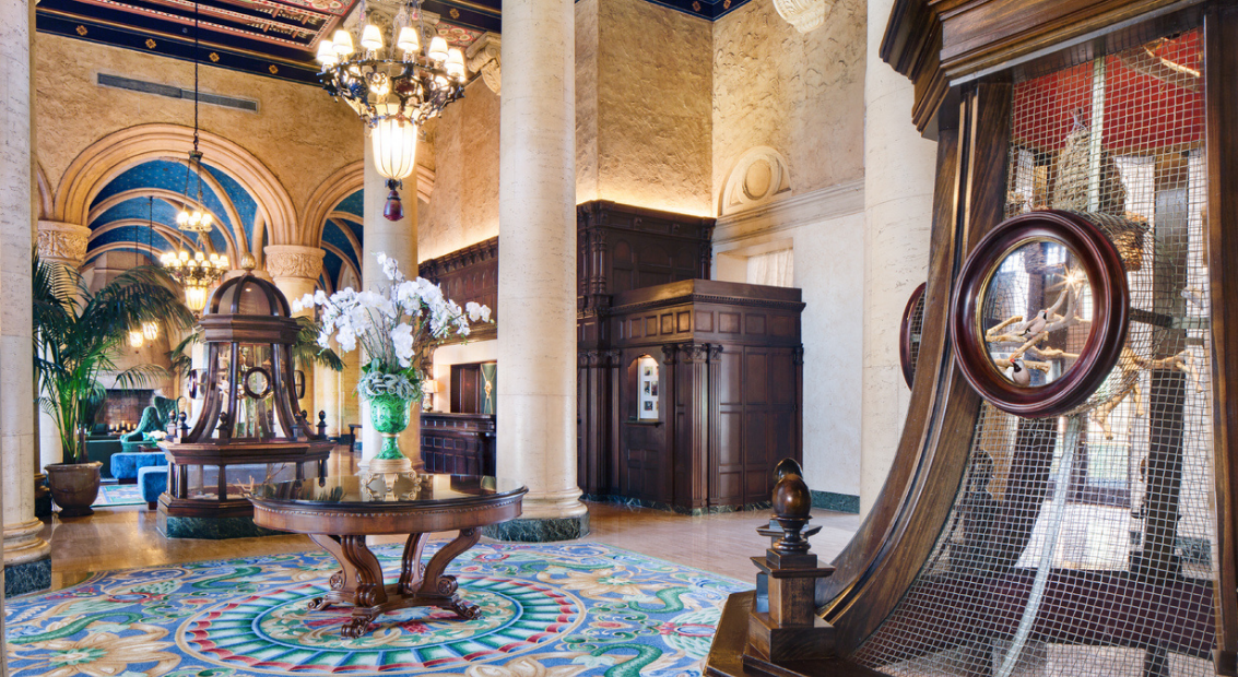
The Biltmore Coral Gables, Lobby
How did your design experience lead you to landing this design job?
Most of my career I have been a high-end residential designer, so actually The Biltmore is a perfect fit for me because it's like 200 some odd little houses or condos; they're all so different. That's kind of the way we approached it things you would like to see in your home. Very comfortable, luxurious fabrics and window treatments for the renovation. We tried to carry that through the meeting rooms and the ballrooms, as well.
What made being lead designer on The Biltmore so special?
The Biltmore is such an iconic property, and it was such an honor to have been contacted because of my past work, to be considered to do that renovation.
The spaces from back in the 1920s are so beautiful. Respecting those spaces, and treating them in the way that they deserve and the way I think George Merrick would have been proud, that's what made it special.

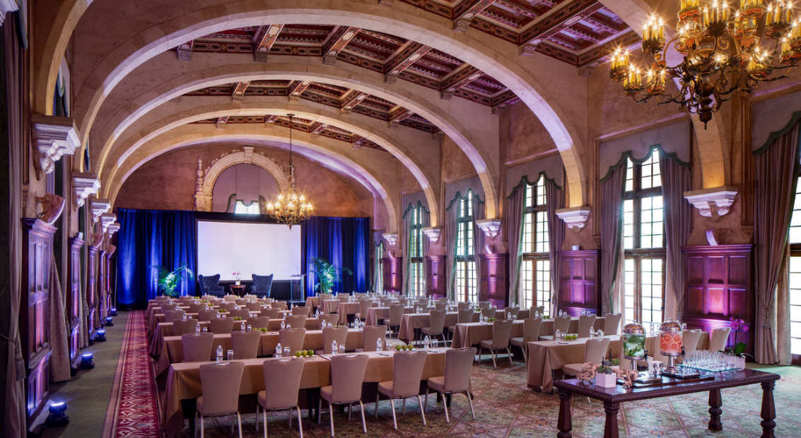
The Biltmore Coral Gables, Granada Ballroom
What did you do to honor the rich history of the hotel?
First of all, everyone has their opinions about The Biltmore, especially the owners, and what you should do to it. Some thought wipe the slate clean, others lots of color, others restore it back to the way it was when Merrick did it originally.
We did a lot of research. My team became very familiar with the history of The Biltmore. We used photos from the era when they were building the hotel, and through the whole history of the hotel. They're large black and white photos, beautifully framed in gold leaf, matted in a very lavish way. I would call it almost a gallery presentation down each and every corridor photos of sports stars who stayed there, movie stars when they broke ground, lots of pictures of George Merrick and his family. Everybody who was anybody back in that day, they're in those photos. They're in all of the guest room and meeting room corridors.
We pulled the original hotel blue prints from the City of Coral Gables archives. We took snippets from those blueprints of the iconic architectural detailing, and we did a nice sepia print and then framed them in shadowboxes that are throughout all the guest rooms. They're done in a more current, modern fashion, but yet the content is the old original blueprint, so it's a very interesting take on that. We thought they were a nice touch, and it gives people a fantastic sense of place when they're in the guest rooms. When they wake up, they know they're in The Biltmore.
Were there any specific areas or items you did not want to change due to their historic importance?
The entire main lobby. We left all of the millwork, ceilings, walls and flooring the way there were. Once we were done with new furniture, fixtures, and equipment, everything just started to shine because it became more connected.
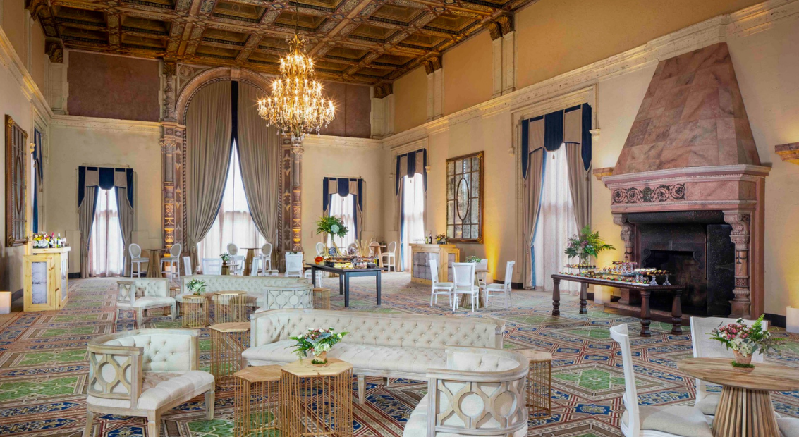
The other areas that we used as inspiration and did not touch were the millwork in Alhambra and Grenada ballrooms. Those are two very iconic ballrooms; there are so many large events that have happened over the decades, from the rich and famous to the local families who had events there. Those are absolutely beautiful; they're colorful. Again, we used those colors and infused the rest of the design with those original colors. We just highlighted it and used other ways to give it a fresh twist.
We've seen hotels that painted over things, or covered things up, or sheet rocked over a beautiful ceiling. We didn't want to do it; those are the gorgeous special touches of the hotel. We made the most of them and brought them to attention more than they had been in the past.

The Biltmore Coral Gables, Alhambra Ballroom
What were some of your inspirations for the design?
What I really thought was [not only] to pay homage to the original design or original colors and concepts and design elements, but to interject with some fresh, new ideas. I think we achieved that by doing a nice mix of traditional, with a few clean line elements as well. When you come into the main lobby, or into any of the renovated areas, you definitely feel that it fits.
You do get this freshness, part of which comes from the color palate that we used. A lot of those influences we pulled from original tile that was in the courtyard, on some of the stairwells coming off the main lobby, and pulled them out of the ceilings, which we were not going to touchpulled that color down into the rugs, furniture. You get this connection between the ceiling colors and the rest of the room and all of a sudden it's all in a different light and it all fits, and it's beautiful.
Did you discover any hidden gems during the redesign?
If there has to be one favorite spot, it's probably the twin staircases in the lobby, with the gargoyles. If you just walk through, you might miss it.

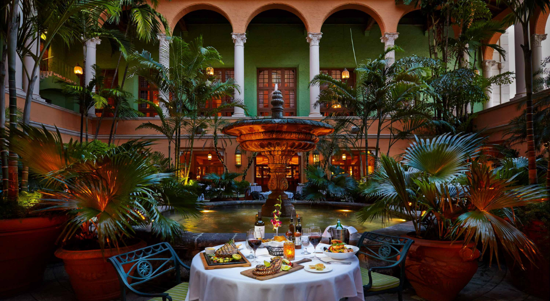
The Biltmore Coral Gables, Fontana

)
)
)
)
)
)
)
)
)
